
A new data scientist can feel overwhelmed when tasked with exploring a new dataset; each dataset brings forward different challenges in preparation for modeling.
This article will focus on getting a quick glimpse at your data in R and, specifically, dealing with these three aspects:
- Viewing the distribution: is it normal?
- Identifying the skewness
- Identifying the outliers
My goal is to show you how to make a quick visual of the data to solve these questions using ggplot2‘s Small Multiple Chart.
Examine the Target Variable
The following guide will use a default dataset from the “MASS” library in R. This dataset contains data on median price for houses in the Boston area. Load it like this:
> library(MASS)
> Boston <- Boston
> head(Boston)
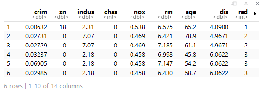
Conveniently, the data is tidy. No cleaning will be necessary. Instead, we can direct our focus on visualizing the data using ggplot2, starting with the key indicator of the dataset, “medv,” which is the median house price.
> require(ggplot2)

#Histogram of medv
------------------
> ggplot(data = Boston, aes(x = medv)) +
geom_histogram()

#Density Plot of medv
---------------------
> ggplot(data = Boston, aes(x = medv)) +
stat_density()


Both histograms and density plots show the general shape of the data; however, it is worth mentioning the differences between the two:
- histograms specifically show where the data is and are preferred when visualizing one variable
- density plots generalize by showing a line of best fit, which helps us glance the distribution of the variable
Some noteworthy observations about the indicator variable “medv”:
- it is not normally distributed
- it is skewed to the right
- there are extreme values/outliers at the tail
It seems we’ll need to handle those outliers to come closer to normalizing our data.
Visualize All Variables
For convenience—and convenience is always welcomed in data science—let’s continue to look at the rest of the Boston dataset using ggplot2‘s Small Multiple Chart.
First, we start by “melting” our data from a wide format into a long format. We will need to call the reshape2 package to perform this. Take a look at the code below for the transformation our data needs for ggplot2‘s small multiple chart.
> require(reshape2)

#Convert wide to long
---------------------
> melt.boston <- melt(Boston)

> head(melt.boston)
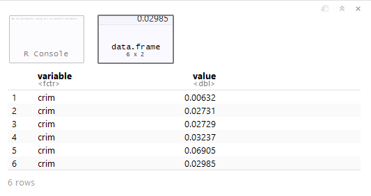
Here, we’ve successfully created a “toy” dataset where the values have been spread into rows alongside a “variable” column. Now, let’s bring in ggplot2 to make quick visuals of all the variables.
#Small Multiple Chart
---------------------
> ggplot(data = melt.boston, aes(x = value)) +
stat_density() +
facet_wrap(~variable, scales = "free")
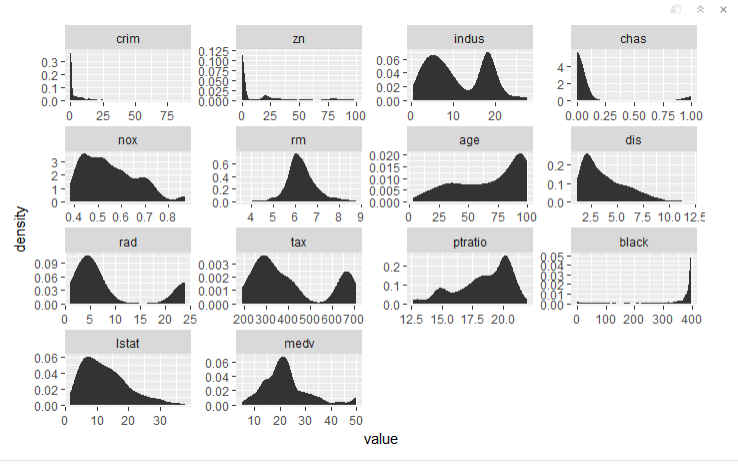
In the plot definition, we faceted (or grouped) by values for each variable and kept the scales “free” so each plot has its own parameters. It’s easy to see how convenient this would be for larger datasets rather than investigating each variable.
Returning to our main questions:
1. Viewing the distribution: is it normal?
The “rm” variable is closest to normal. This means most of our data will need to be transformed.
2. Identifying the skewness
We can see that “crime,” “zn,” “chaz,” “dis,” and “black” are highly skewed. Several other variables have moderate skewness.
3. Identifying the outliers
boxplot(Boston)
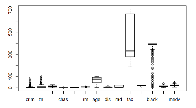
Outliers can be found using R’s boxplot function and the methods to deal with them will vary. Simply removing them is rarely the correct method. We won’t touch on methods here, but rather focus on the variables that need transformation to normal distributions.
Looks like transforming our data to remove outliers will be a big task to help normalize the data.
Dealing with these outliers will take a more subjective course of action (e.g., K-Nearest Neighbour, mean values, etc.) which we can discuss in a future article.
Recap
We managed to position ourselves to better address the data’s needs by:
- plotting the target variable using ggplot2
- reshaping the dataset from wide to long using reshape2‘s melt() function
- plotting all the variables with ggplot2‘s small multiple chart
- examining the output for skewness and outliers
For a more thorough understanding of ggplot2‘s capabilities, I recommend taking all three of DataCamp‘s Data Visualization with ggplot2 courses to become more acquainted with the syntax.

What about visualizing categorical data?
LikeLiked by 1 person
Great Article! Please post one regarding the handling of outliers?
LikeLiked by 1 person
In due time!
LikeLike
Nice idea using melt
LikeLiked by 1 person
Nice post on a great way to use ggplot + tidyr,, but..; I think the package DataExplorer (https://cran.r-project.org/web/packages/DataExplorer/vignettes/dataexplorer-intro.html ) is doing that without effort.
However, your post is very pedagogical and informative
LikeLiked by 1 person
I’ll check it out Bontemps. It never hurts to shorten the process.
LikeLike
Hey, nice and practical guide! Thanks for sharing!
A small note: medv is skewed to the right, not to the left, as its tail goes to the right, and that’s where skewness is characterized from.
LikeLike
Good Catch! Thanks.
LikeLike
Could you please add a Python equivalent codes to those nice viz you just showed up?
LikeLike