
Today we incorporate a bit of television history with our data…
The Simpsons TV show needs little introduction—it is well-received as one of the pioneering “made for adults” cartoons. It rose to popularity with characters who were carefully developed with clear morals so fans could anticipate their reactions.
Moral consistency is what let the characters grow in the audience’s heart. Homer was the fool of the show, but his comedic mishaps often revolved around good intentions to care for his family.
This era between Season two and nine was coined “Simpsons Mania.”
However, something happened. Writers and producers left the show to continue on with their careers and new writers either failed to emphasize the heartfelt values each character possessed or betrayed those values entirely.
The post-Simpsons mania was deemed “Zombie Simpsons,” where our beloved characters had become shells of who they once were.
Let’s use this as inspiration to practice our graphing skills by adding some highlights and aesthetics, in stages, in an ode to The Fall of The Simpsons.
Scraping Our Data
Check out the full R markdown from my Github repository here
First, I needed to scrape The Simpsons ratings and episode details off the Simpsons’ IMDB.
I’ve gone through scraping in a previous article using Spotify charts and a CSS selector where you can learn to build one yourself and prepare it for most websites. For now, I’ll give you a glimpse of the design I made to pull the information I wanted.
> imdbScrape <- function(x){
    page <- x
    name % read_html() %>% html_nodes('#episodes_content strong a') %>% html_text() %>% as.data.frame()
    rating % read_html() %>% html_nodes('.ipl-rating-widget > .ipl-rating-star .ipl-rating-star__rating') %>% html_text() %>% as.data.frame()
    details % read_html() %>% html_nodes('.zero-z-index div') %>% html_text() %>% as.data.frame()

    chart <- cbind(name, rating, details)
    names(chart) <- c("Name", "Rating", "Details")
    chart <- as.tibble(chart)
   return(chart)
 Sys.sleep(5)
}
Try my SpotifyCharts project if you want a deeper explanation regarding scraping data.
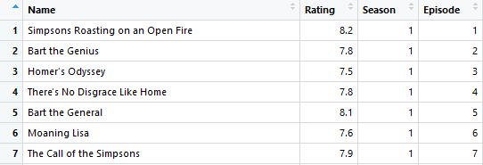
Here’s what our pull should look like:

Now, a bit of tidying is needed so we can group by Season for our graph. I used str_extract() to split the Details column into Season and Episode. All the code for this project is in the Github repository mentioned above.
Customizing the Plot


I’ll go ahead and break down how I gradually added to this graph in sections, building on each layer:
1. Main line graph: A bit of grouping and summarizing so we can get season averages. Overall, just a standard geom_line with some color and line thickness modifications.
> Simpsons %>%
  group_by(Season) %>%
  summarise(Rating = mean(Rating)) %>%
  ggplot() +
    geom_line(aes(x=Season, y=Rating), color = "Blue", size = 1.5)

2. X-axis modification: Opting to have every season represented on the x-axis by changing the breaks.
> Graph_1 +
  scale_x_continuous(breaks=c(1:28), labels=c(1:28), limits=c(1,28))

3. Adding highlights and text: Using the x- and y-axis as grids to drop text and make transparent rectangles (adjusting the alpha value).
> Graph_2 +
   # highlighting Simpsons Mania
    annotate("rect", xmin=2, xmax=9, ymin=8, ymax=8.9, alpha = .4, fill = "yellow") +
    annotate("text", x=5.5, y= 8.6, label = "Simpsons Mania", color = "black") +

  # highlighting: Zombie Simpsons
    annotate("rect", xmin=13, xmax=28, ymin=6.5, ymax=7.2, alpha = .2, fill = "red") +
    annotate("text", x=20.7, y= 7.1, label = "Zombie Simpsons", color = "black")
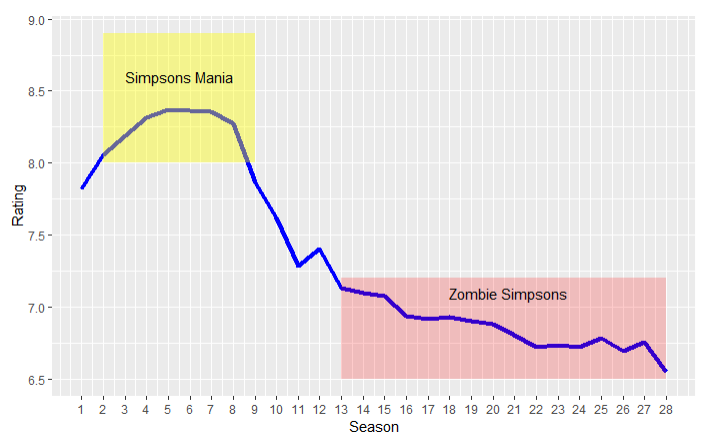
4. Average line: A dotted line (linetype = 2) better defines my two regions as above and below average.
> Graph_3 +
  geom_line(aes(x=Season, y=mean(Rating)), linetype = 2, color = "Black") +
    annotate("text", x = 27, y = 7.45, label = "avg", color = "black", size = 3)

5. Adding all the labels and their modifiers
> Graph_4 +
    labs(title = "The Steady Decline of The Simpsons",
         subtitle = "Average Episode Ratings by Season",
         caption = "Source: IMDB, August 2018",
         x = "Season",
         y = "Rating") +
    theme(plot.title = element_text(family='', face = 'bold', colour = 'black', size = 20),
          plot.subtitle = element_text(family='', face = 'italic', colour = 'black', size = 10),
          plot.caption = element_text(family='', colour = 'black', size = 10),
          axis.title.x = element_text(family='', face = 'bold', colour = 'black', size = 12),
          axis.title.y = element_text(family='', face = 'bold', colour = 'black', size = 12),
          )

6. Overall theme adjustments: Added Simpsons yellow and used the black/white theme to remove the grey grid.
> Graph_4 +
    theme_bw() +
    labs(title = "The Steady Decline of The Simpsons",
          subtitle = "Average Episode Ratings by Season",
          caption = "Source: IMDB, August 2018",
          x = "Season",
          y = "Rating") +
    theme(plot.title = element_text(family='', face = 'bold', colour = 'black', size = 20),
          plot.subtitle = element_text(family='', face = 'italic', colour = 'black', size = 10),
          plot.caption = element_text(family='', colour = 'black', size = 10),
          axis.title.x = element_text(family='', face = 'bold', colour = 'black', size = 12),
          axis.title.y = element_text(family='', colour = 'black', size = 12),
          plot.background = element_rect(fill = "yellow")
          )

Nicely done!
If there’s one thing The Simpsons can teach you how to do right, it’s how to make a nice-looking graph of their wrongs.
What to do next: try and apply this to other TV shows to highlight any incredible moments in their history. You have all the tools at hand now.
Thanks for reading!

Nice, but there is no reason to have vertical lines between seasons and the pixelation could be removed by using cairo.
LikeLike
My eyes prefer the structured background, but I’ll agree there is no mathematical significance to those lines being there. I have seen “remove-to-improve” theories behind data viz and I’d agree it to be an outlook I ought to embrace more. As for pixelation — it happens from my lack of access to a quality editing-program at home so I lose out on a vectorized version of my charts.
Appreciate the remarks vlllad!
LikeLiked by 1 person
Nice work! Tufte believes in the remove to improve theory. It seems this is a good idea to keep in mind but perhaps not follow it strictly as one would not follow their GPS strictly (for example) especially as our charts move out of the hands of the few and more likely in the hands of the many. Storytelling is also an art and will hopefully be left up to the storyteller while applying to agreed upon standards of course. I personally like your highlighting and labelling of the two important areas in your story – the mania and the zombie.
LikeLiked by 1 person
Thanks She! Well put example with the GPS – there is no perfect way or else we’d suck the fun out of visualization. I do appreciate vlllad for noting the style choice since I had not thought to remove the grid when considering my final design and I want to make conscious considerations surrounding final designs in the future.
Glad you’re both here!
LikeLike
Cool plots. Some inference would be nice to serve as a capstone.
LikeLike
I’ve seen other TV show analysis look into the episode variances by season using boxplots that could be a really nice next step into concluding a best/worst season?
The video in the intro offers some alternative ideas to plot too ex.significant writers leaving the team or landmark episodes. With a bit more data, you could look into season volatility being a plausible reason for a drop in viewership.
As for this article, I made a graph turn yellow because I wanted it to look like a funny cartoon I liked back in the day. However, great to think about other possibilities I could do next.
P.S. I notice that pic you have too, Phil. Thanks for the comment!
LikeLike
Y-as really should start at 0 to give an accurate view of the relatieve differences…
LikeLike
check the reply i made to cj little — totally valid observation Wouter!
LikeLike
Thanks for writing this up – great data source, great tutorial. However, am I the only one that is bothered by the origin not being at zero for the y-axis? It makes the zombie era look even more dreadful than it actually was/is!
LikeLike
Hi there cj! You bring up a great point here about the ethical display of data; often enough, charts aim to deceive us.
I initially considered a complete 0-10 rating scale for the y-axis which, of course, gives a less dramatic view of the graph. I found when the graph was scaled out so far, it was hard to prominently highlight the sections – which is what I sought out to learn in the first place! Condensing the y-axis alleviated this.
Now, my justifications relate to educational convenience. If one was to skew a graph for displaying business insights — yikes. Reflecting back, a fixed scale between 5-10 could be a strong consideration as a tweak. I feel even a 1-point difference in ratings does reflect a significant drop in quality. I usually don’t watch movies under a 7.5 on Netflix so 7.2 feels like a big dip, you know?
Wise observation. Glad you pointed it out!
LikeLike
I agree, in this example I think the graph makes more sense starting from a non-zero value. I’ve only had a quick look at the IMDB ratings but even the worst Simpsons episode has a 4.3 rating, and movies that win Razzie awards tend to score between 4 and 5. So in practice the “real” worst rating seems to be something like 4 rather than 1, if that makes sense.
Nice article, I decided to re-create it in Python for practice.
LikeLike
Good point Putcher; it would be comparable to focusing on 2 standard deviations of data instead of having all 3. I think there is merit in making a fixed y-axis something like 5-10 for this example.
Glad you were inspired and good chart! Feel free to share a GitHub link since it could help others coming here with Python expertise.
LikeLike
Very cool post Jake, I was actually creating a very similar graph yesterday when I came across this post. I used the same dataset, but with a few more features that I picked up from Kaggle (https://www.kaggle.com/karineh/simpsons-view-analysis/data).
I created a plot that shows the same trajectory you have shown here, but with an additional line that incorporates a weighting scheme to the episode ratings based upon the number of ‘imdb_votes’ each episode received. In doing so the episode rating for an episode with more votes receives a greater weight when calculating the season average. I created a couple other graphs as well highlighting character ‘importance’ by season and threw it all in my GitHub account if you were interested (https://github.com/curtisburkhalter/Misc_RProjects/Simpsons_script.R).
LikeLike
Dang Curtis, the Github link is broken; sounds like a great follow-up project.
Would you mind reposting it for myself and others interested?
LikeLike
Here it is https://github.com/curtisburkhalter/Misc_RProjects
LikeLiked by 1 person
This is awesome! I had so much fun recreating this. I tried it on the Bachelor (trying to prove that Arie is the worst Bachelor in show history, obviously) and got an error that I think I traced back to missing ratings for some episodes. Is that possible? Your code is a bit more advanced than I am so I wasn’t able to address it myself.
LikeLiked by 1 person
Oh many this is a really great idea. I was thinking to myself what other graphs I could make and considered the big rise and dip in Bitcoin, but I feel we’re all exhausted from hearing about Bitcoin everywhere we look. Feel free to add me on LinkedIn and PM me a gist of code or an .rmd file — I wouldn’t mind cracking my knuckles on it!
LikeLike
This is great, thanks for this. Tried it with other shows, such as Modern Family, and confirmed my feelings on when it declined too.
For anyone looking to adapt it to other shows you need to change ‘timevalues <- 1:28' to the number of seasons there are (eg Modern Family has 9 so I changed it to 'timevalues <- 1:9'). Obviously you need to change other parts to make the output graph content make sense but you won't be able to get that it to work without this change.
LikeLike
Hey Jonathan! Glad to see others applying this to different shows. Easy enough to do! The ‘variables’ do get even more complex. Just wait until you stumble upon multiple in a link. I had a scrape where I went through a URL like
/champion1/role1
/champion1/role2
/champion2/role1
/champion3/role1
Ended up crawling through the champions to extract roles then did some pasting so i could use that vector for the URL crawler THEN I could scrape the relevant information from each page.
Alas, Modern Family had a good run. Let’s see if they can learn something from the Simpsons and not become ‘Zombie Family’ for 20 more seasons.
LikeLike
Pingback: Scraping & Plotting: Who Is the “Worst” Bachelor? – datacritics
Hi Jake, this is great I really enjoyed it. I have started with R a while ago and I feel confident enough to go a bit deeper. I tried accessing your Github repository through the link but it directs me to an error 404 page. Could you provide another link please?
LikeLike
I found it!
LikeLiked by 1 person